Redesign · 14 directions
Pick the landing page that feels like PhotoMagic.
Same simple, two-colour system (ink + a single violet accent), same real event photos. Open each, then tell me which one to ship as the homepage.
New · Meet the mascot
A whole new PhotoMagic logo.
An owl whose eyes are camera apertures — the mascot, the aperture and the magic, in one mark, with every motion.
New · Motion system
The brand, in motion.
Animated logo variants, branded loaders and action feedback — explore the full motion language.
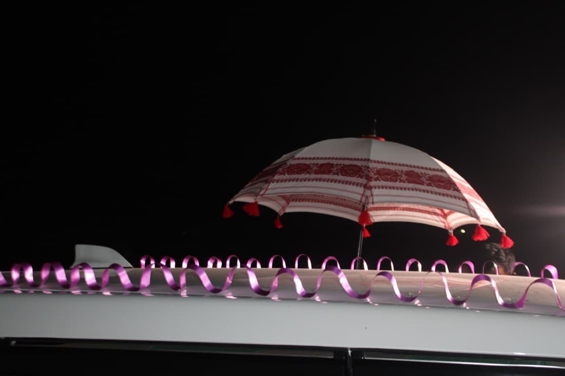
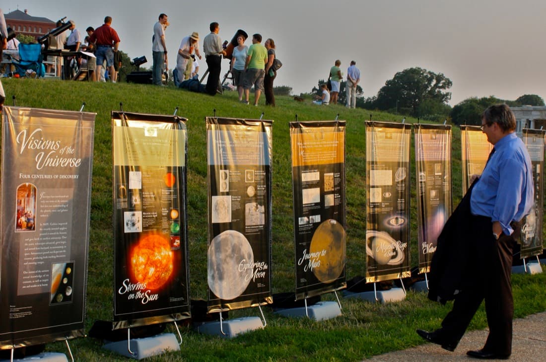
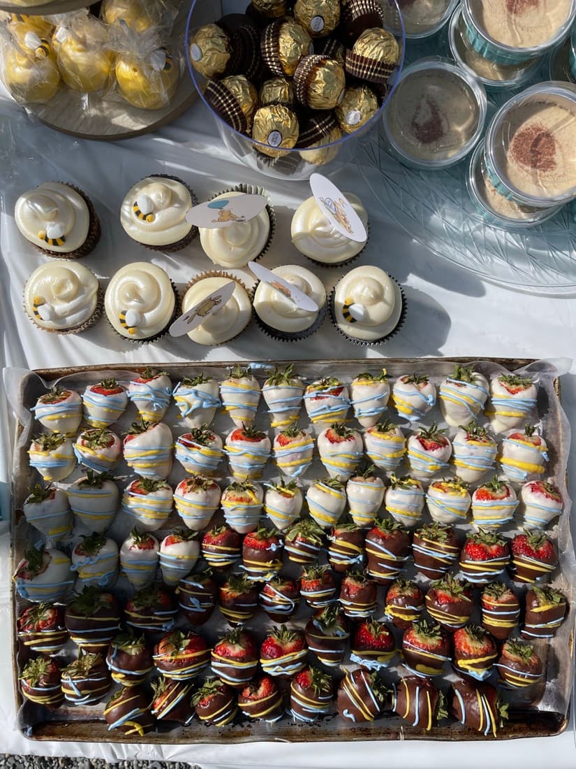
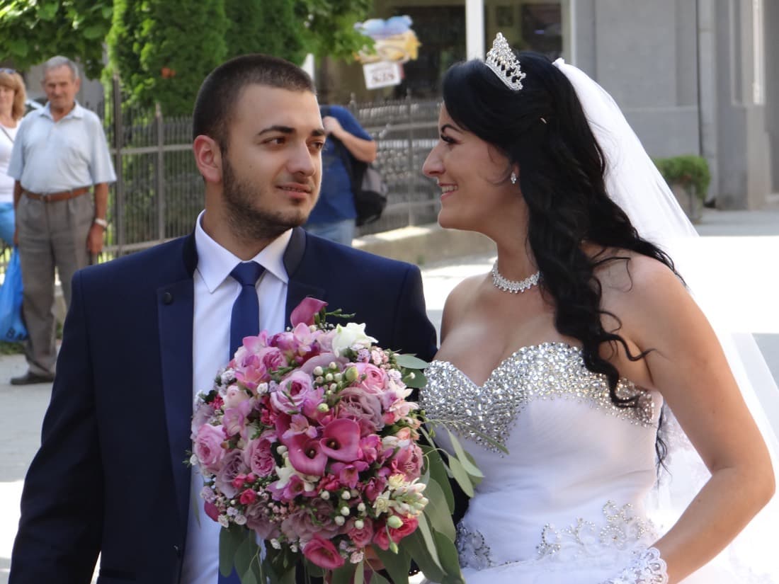
A · Editorial
A magazine-style hero with a full masonry wall of real event photos. Lots of whitespace, a serif headline, the interactive Keep/Maybe/Reject demo. Feels like a high-end print studio.
View this design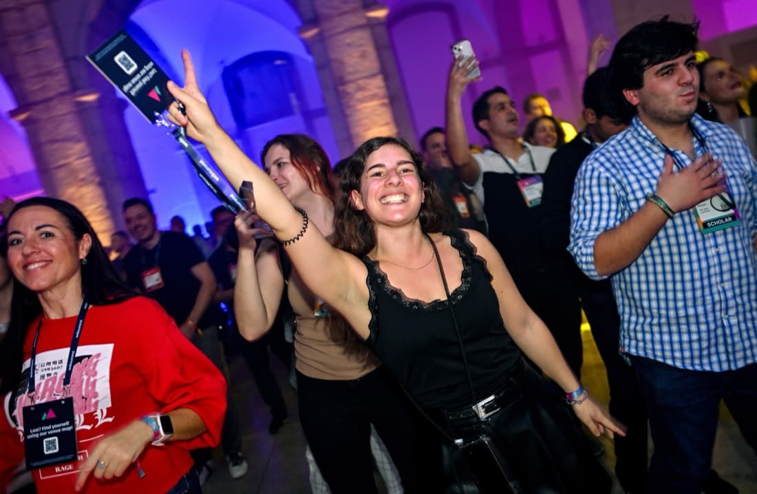
B · Product
Split hero with a living product window — a photo grid with keep/reject states, live collaborators and a mass-rotate button. Bright, modern SaaS energy that proves it works at a glance.
View this design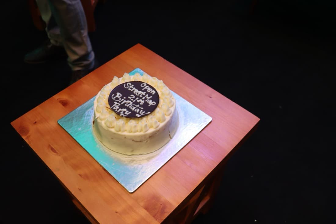
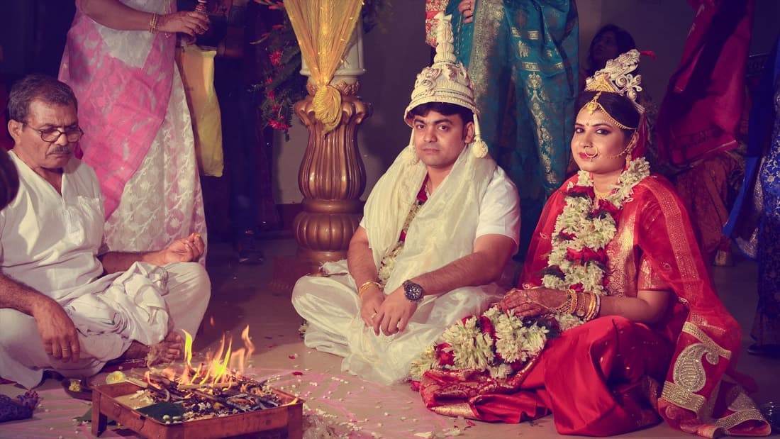
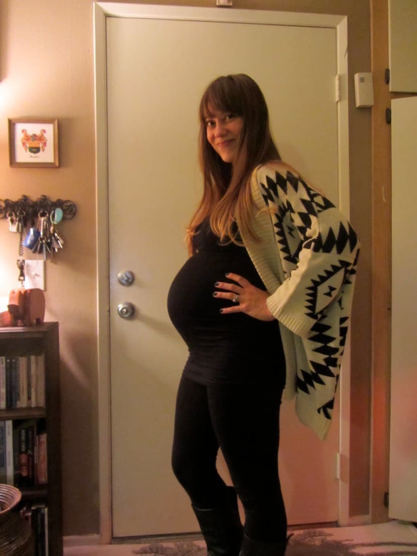
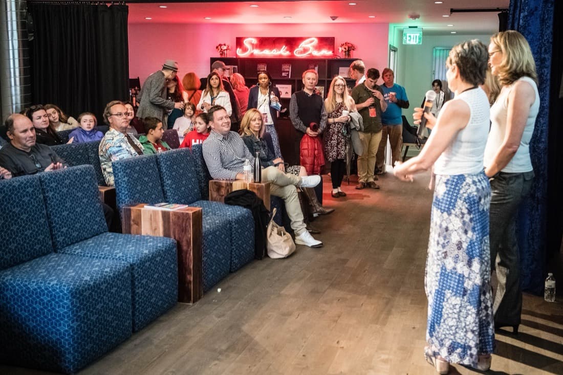
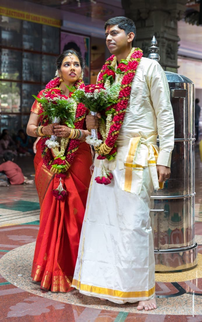
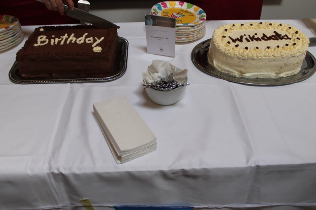
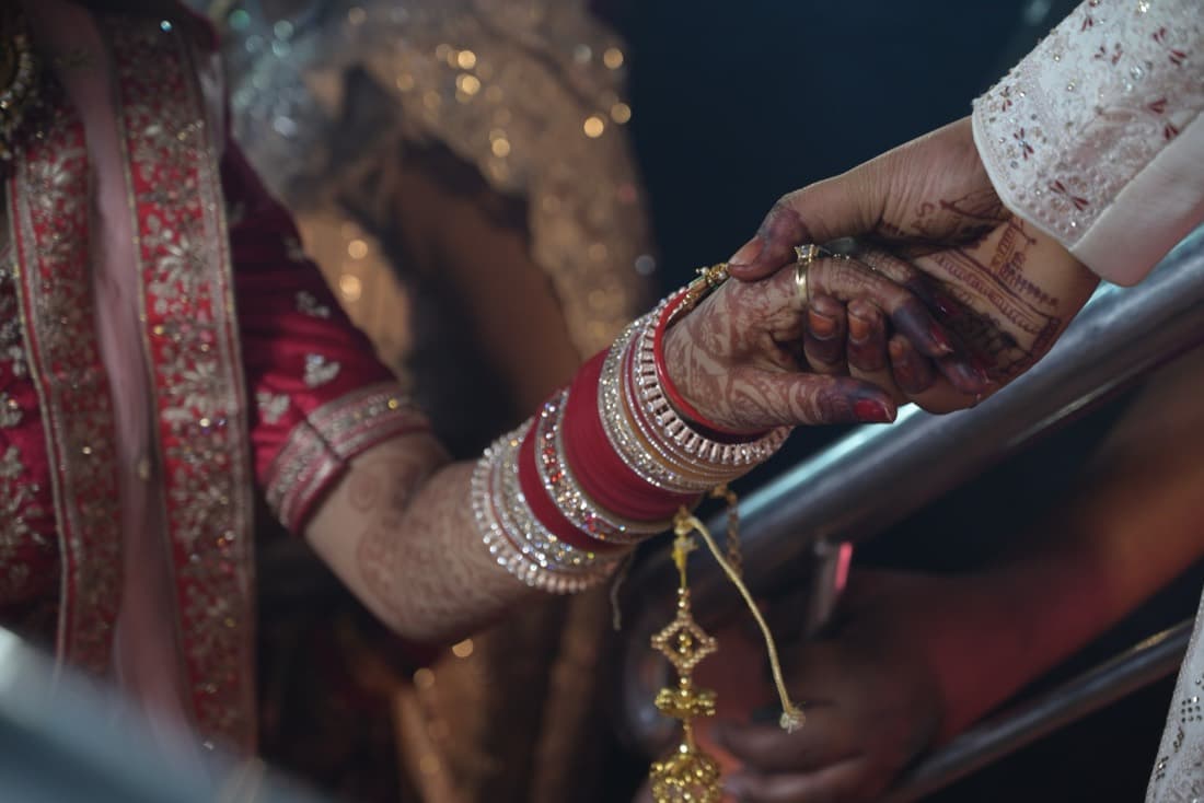
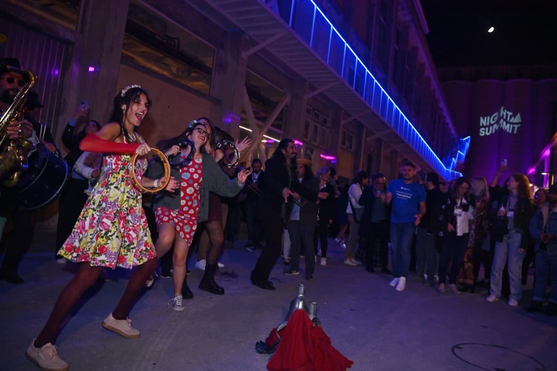
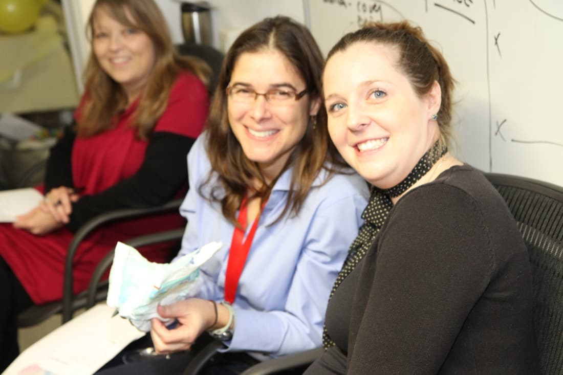
C · Story
A dark, full-bleed hero with rows of event photos drifting behind a glowing headline. Leads with feeling — every event deserves its best photos — then shows the flow. The most dramatic of the three.
View this designD · Mosaic
A full-bleed wall of event photos as the background, with the pick/choose card and the interactive Keep/Maybe/Reject demo floating on top behind frosted glass. The photos are the hero.
View this designE · Workflow
Feature-forward. The hero is an animated Drive → pick → sync pipeline, leaning into the part nobody else does: pushing your final keepers to a Google Photos album or a clean Drive folder.
View this designF · Bento mix
A dashboard-style bento grid mixing all of it — hero, the live app window, the sync pipeline, collaboration, duplicates, history and a photo marquee — in one modern, tile-based layout.
View this designProduct, refined · your feedback
Three takes on “B · Product”.
Animated, typing event types · Keep/Maybe/Reject moved right under the hero · the features section compressed to icons · and a rethought pricing line.
B1 · Live
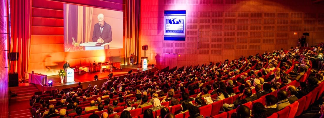
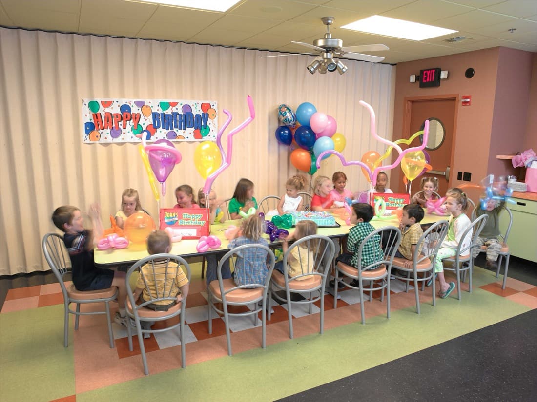
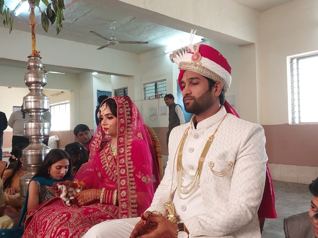
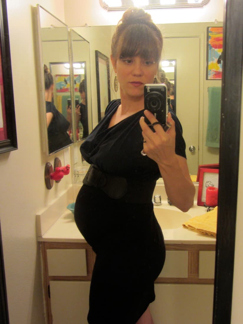
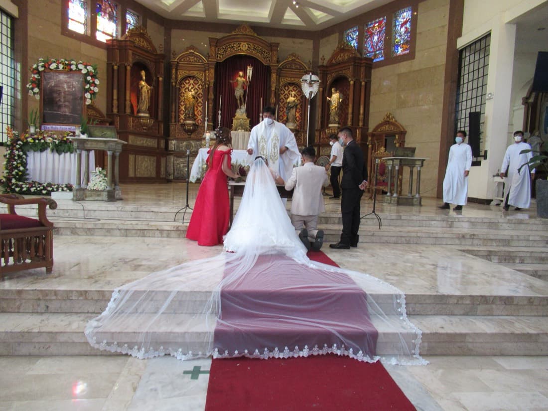
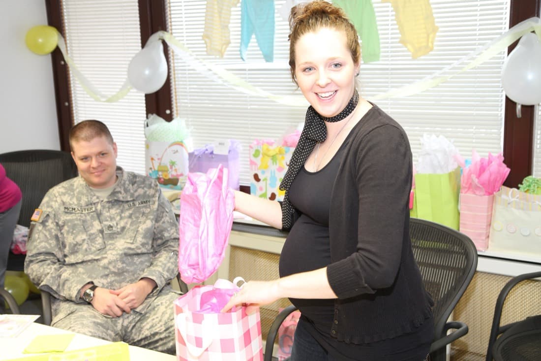
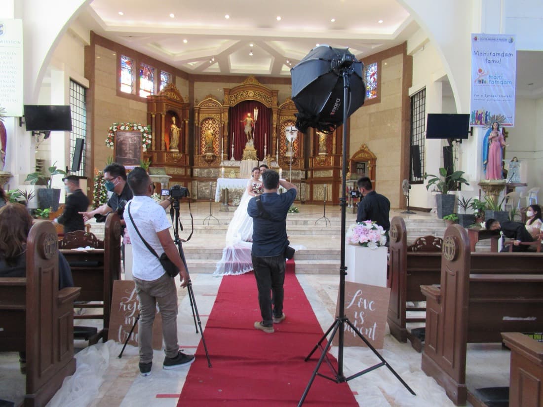
The headline types out “…from your wedding / conference / birthday”. Keep/Maybe/Reject moves right under the hero, an animated event-type grid replaces the strip, and features compress to icon chips.
View this designB2 · Spotlight
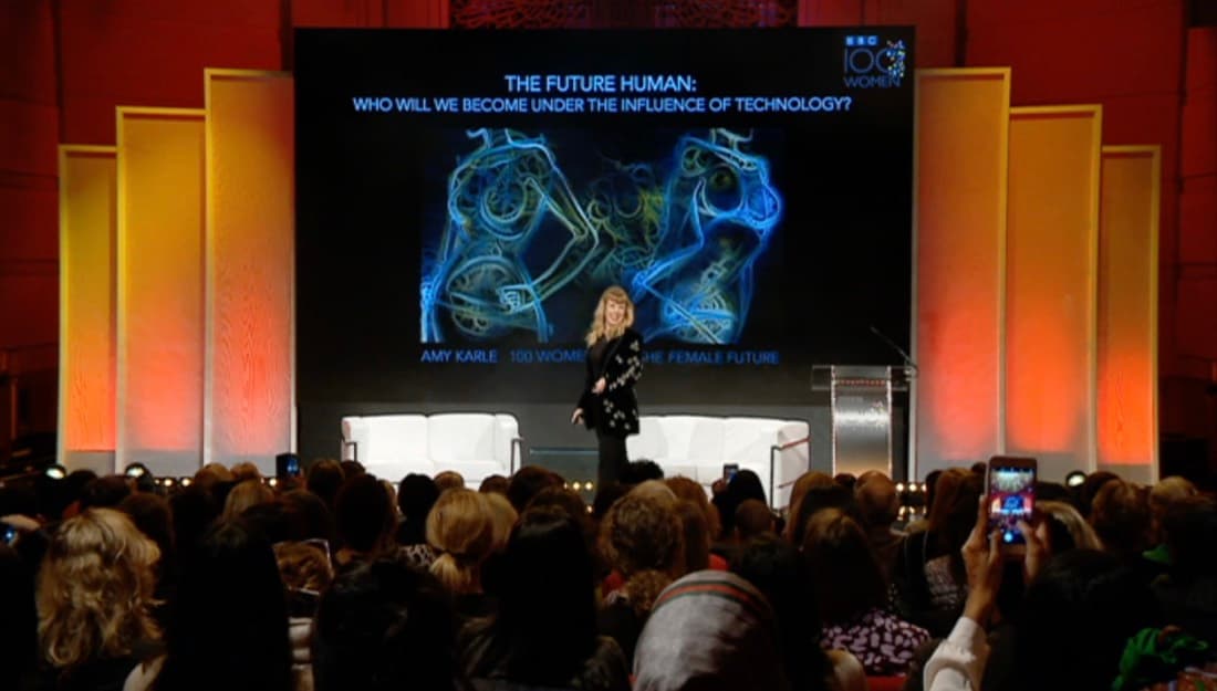
The event type becomes the giant focal word, cycling. A dark triage band sits under the hero, the shoot types fan out as an overlapping photo stack, and features shrink to a tidy icon row.
View this design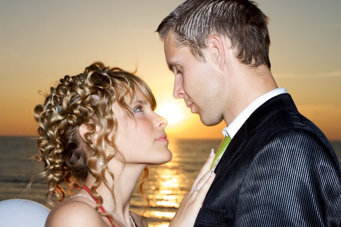
B3 · Reel
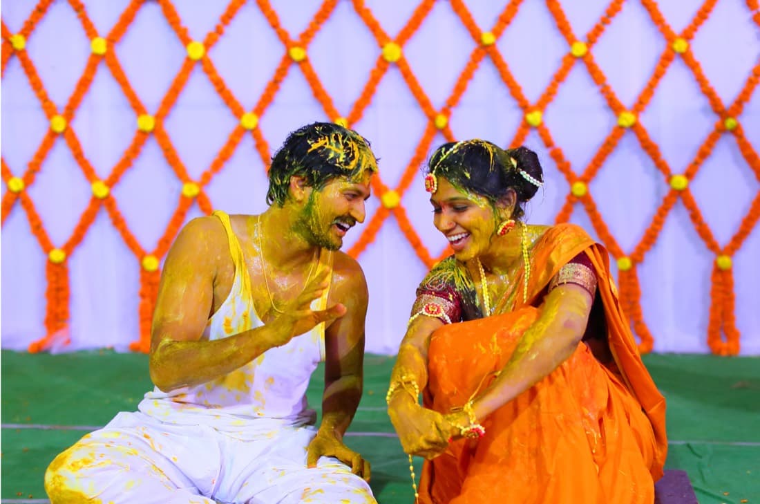
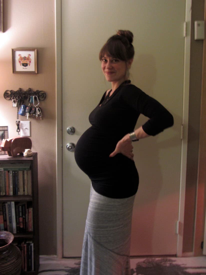
Typing lives in the eyebrow; the shoot-types get an animated showcase plus a tall two-row photo reel. Features become a single minimal icon strip with the new “pay once per event” line.
View this designB3 · Reel — chosen direction
Backgrounds & colours for the Reel.
You picked the Reel. The Grid version is live on the homepage now — here are background and accent colour alternates if you'd rather ship one of these.
Reel · Grid
The version now shipping as the homepage — soft grid lines behind the hero and the feature strip add a modern, technical texture under the same violet accent.
View this designReel · Flat
The original flat-white Reel with no background pattern. Cleanest and quietest — lets the photos and the app window do all the talking.
View this designReel · Dots
A dotted background instead of lines — a touch softer and more playful than the grid, still on the violet accent.
View this designReel · Emerald
Same layout, swapped to a fresh emerald accent over a green-tinted grid. Calmer, more “trust / organised” feel.
View this designReel · Amber
A warm amber accent over a honeyed grid — friendlier and more celebratory, leaning into the wedding/event mood.
View this designReel · Rose
A soft rose accent over dots — romantic and editorial, a natural fit for wedding and maternity shoots.
View this design